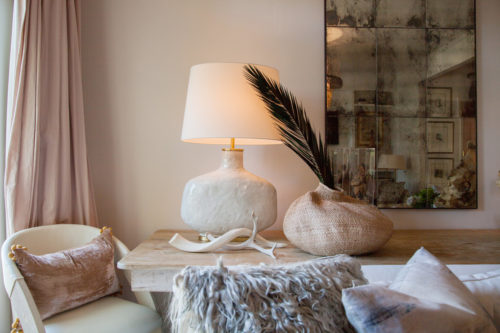
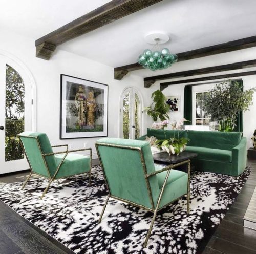
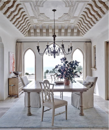
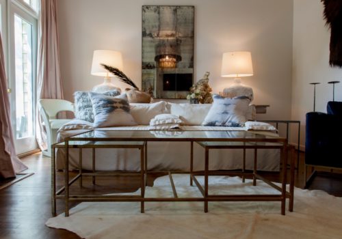
All About Texture
I can’t get enough of it.
If you’re like me, you may sometimes have a creative tug of war with yourself while designing? Let me give you an example…
What should my color palette be?
Do I go with neutrals for a muted, calming effect?
Do I wax bohemian with a seemingly incongruous mix of color and print that magically come together in a stylistically cohesive stroke of brilliance?
Am I feeling all glam lacquer and brassy hollywood – regencyish?
AND…these questions could all be swimming around in my noggin for the SAME room! Often, there are so many options and directions to take your vision that it can feel overwhelming. However, whenever my decorative neurosis strikes, my go to therapy is TEXTURE!
Seriously. Make it your mantra. Texture, texture, texture. Mixing and varying the tactile qualities in your space will never let you down. I promise!
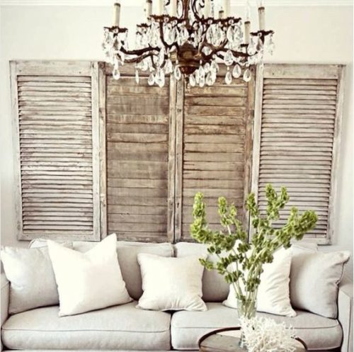
The next time you’re having an inner design dialogue and just can’t get your style mojo going, try out these tips for creating a texture rich room that will be a feast for the design weary eye :
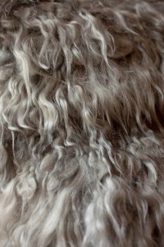
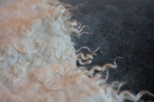
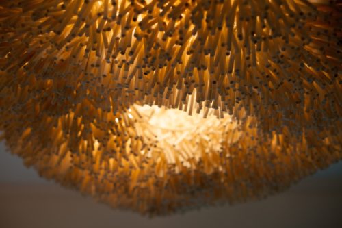
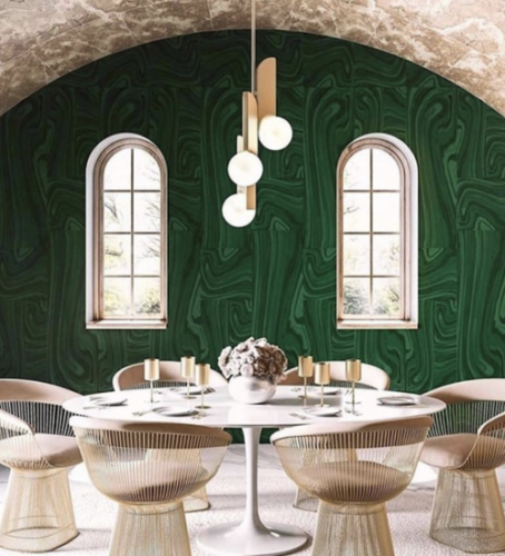
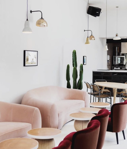
- Hide and Fur
- Just like a good hair day, animal hide rugs, benches, and pillows make everything look and feel better. Try Tibetan lamb for a more luxurious take on fur. These rich accents will provide visual interest and depth to your space instantaneously.
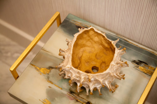
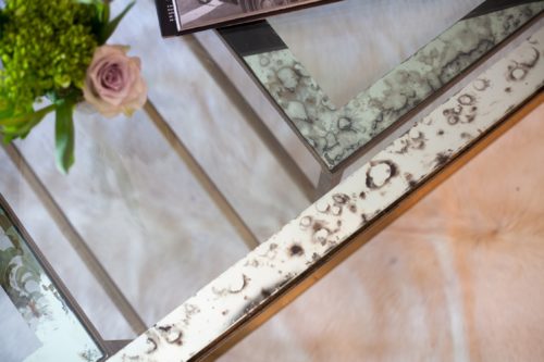
- Organic
- Mother Nature is the best decorator of all..so put her to work! The use of organic materials will naturally add interesting and varying shapes and feel to the room. Think natural stone table tops and floors, driftwood, and teak, coral (that has already been harvested), minerals such as pyrite, crystals and quartz as objects for tables. Old clay pots, raffia window shades, and natural grass carpets will anchor your room with tactile sophistication.
- Natural Fabrics
- Linen is your new best friend, so let it also be your hero for the major upholstered pieces. Layer in your extras with a mohair covered ottoman, a leather chair, an alpaca throw over the back or the arm of your sofa. Keep it airy with cotton or linen scrim as window dressing, or go more luxe with fluffy silk or tailored wool curtains.
- Bling
- Don’t forget to mix in your metal. A funky hammered silver chandelier, mid century brass lamps and tables, gold and copper hardware. The hard surface and light reflective quality that metal offers is the perfect foil – pun intended – to the quiet foundation that your linen, leather, fur, and mellow woods play.
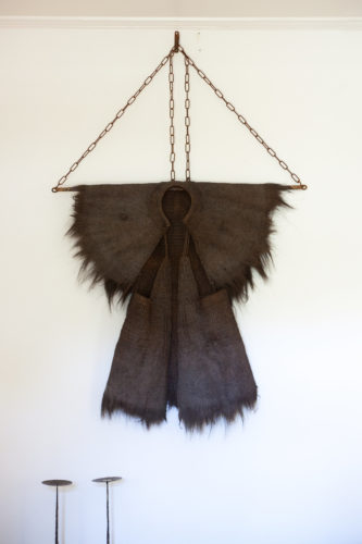
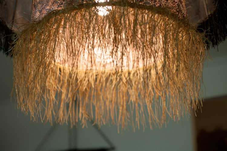
- Layered Thinking
- Layering is your baseline textural tool. Mix in faded Turkish rugs and sheepskins over your grass carpets, bespoke soft wool or slubby raw silk curtains over raffia shades, fringy throws over ottomans, piles of pillows in a full textural range…the choice is yours! Or, you could up the ante on your upholstered seating by applying trims in cotton or linen tape with tiny spaced metal nails or tacks.
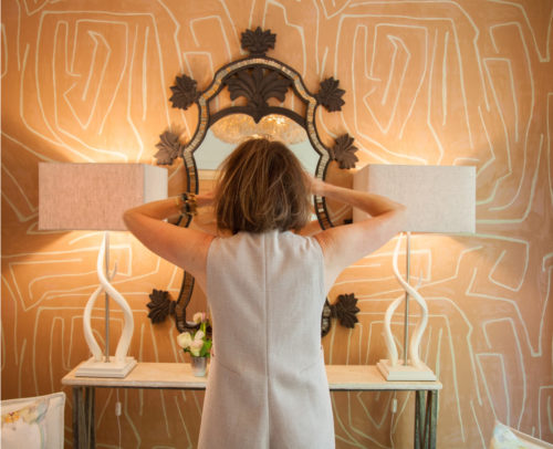
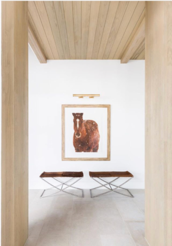
- Below are some examples of how I have used a strong textural palette to add interest and to bring depth to different spaces in my own home.
So, remember your mantra..texture, texture, texture. By allowing a juxtaposition of surfaces like soft and smooth, rough and sleek, rustic and luxurious, you will create a daring space with a vibe that is all you. And, bonus, you will have trumped the oh-so-tired questions of color versus neutrals and solids versus patterns! Your space will be a brilliant textural triumph that YOU created, you go mix-master!
Images courtesy of Alex Lukey Photography — Cute DIY Projects — Dining Room Lighting – Elle Decor – Tineke Triggs ADL designs
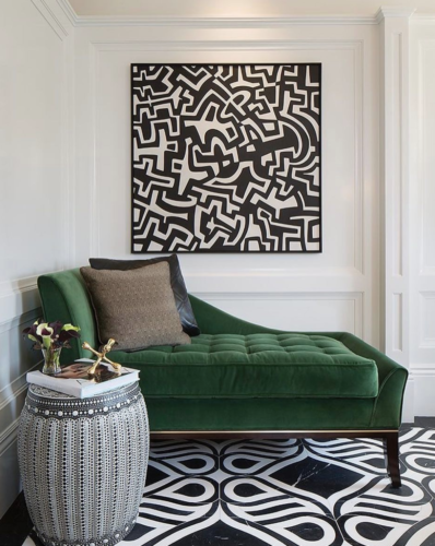
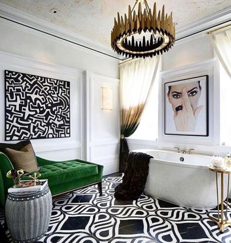
Black and White Done Right
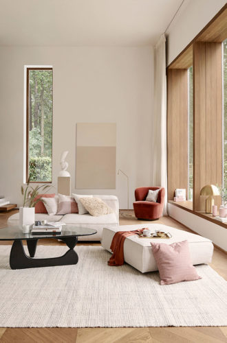
Neutralize and Soften
The thing about black and white is that it can render the most chic and sophisticated of spaces, but, in my opinion, can also play off as stark and cold. My method to making the black and white room stylish and inviting is two fold. First, keep your black and white color selections soft. For black tones go off-black, and for your whites lean toward chalky and bleached bone hues, not pure whites. Second, add in an earth tone or warm accent color and neutral textural elements. I am partial to tans and caramels in suede, leather, mohair or wool and a touch of warm wood for a neutralizing effect. Use natural cotton fringes, shearling accents (real or faux) and neutral or natural grass rugs as softening textural tools. I call this look black, white and warm. Remember you are just accenting here, so keep black and white your dominant palette and just dab your canvas with these tonal and textural additions.
A picture is worth a thousand words, so here are some style photos for inspiration.
Warm Wood Accent 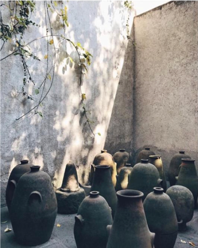
Off Black and Bleached White 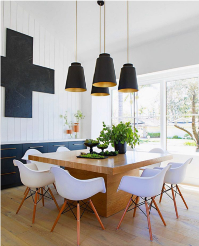
Warm Wood Table 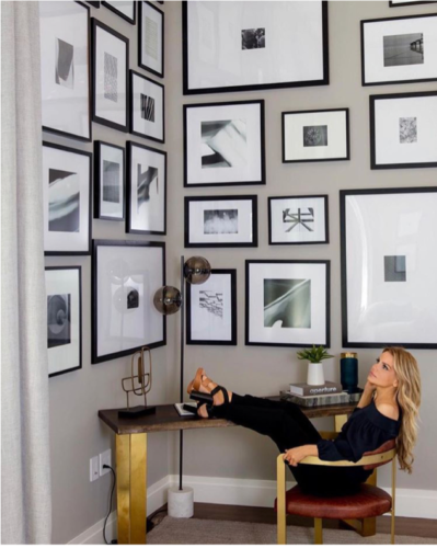
Putty Color Backdrop 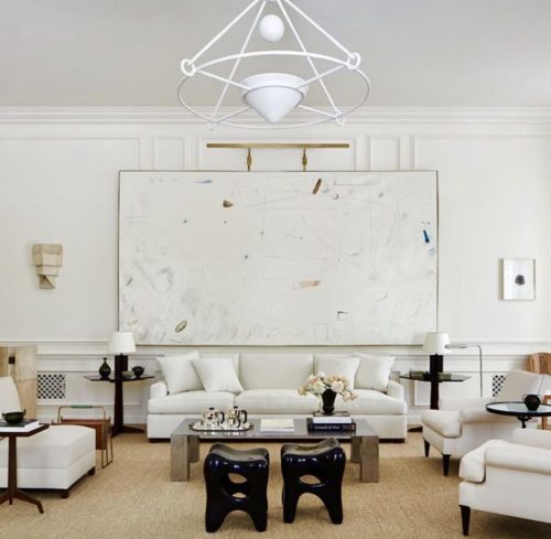
Earthy Grass Carpet 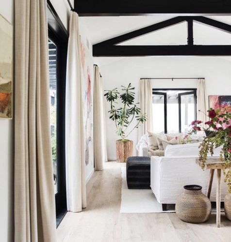
Warm linen, wood and straw accents 
Chalky White and Clay Tones 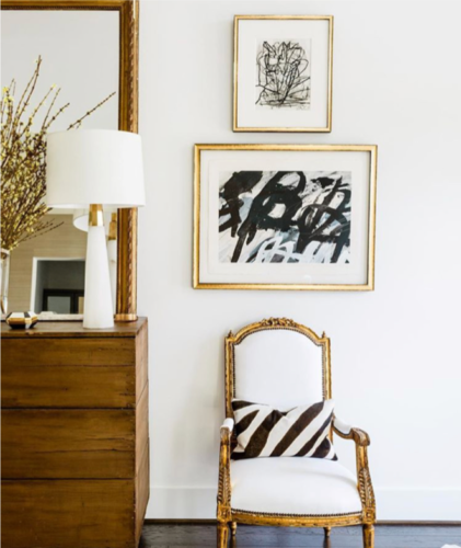
Warm Wood Accent 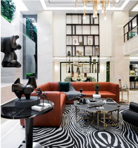
Earth Tone Sofa 
Earth Toned Leather and Upholstery 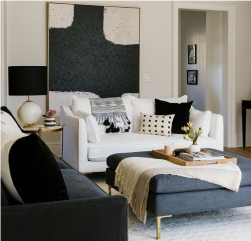
Warm Gray Upholstery 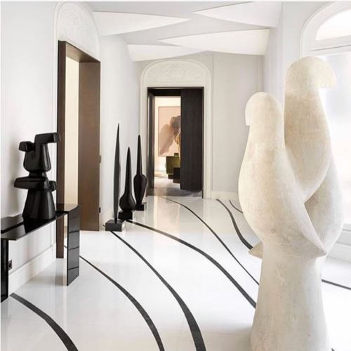
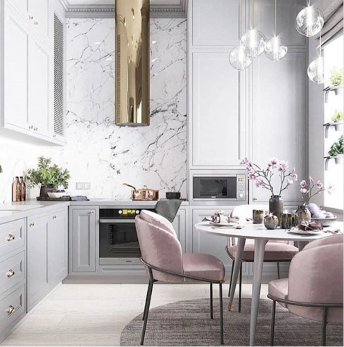
Warm Cased Opening and Warm Marble
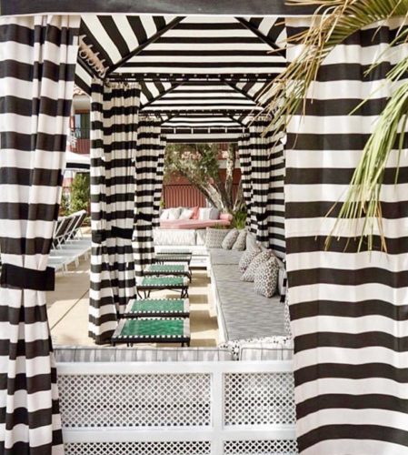
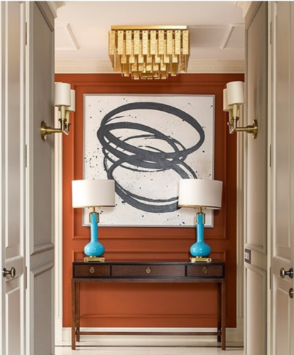
Think Green
When working on a project with a black and white palette, if I am feeling more crisp and clear or my client’s preferences are such, my go-to accent color is green. In this instance, you can venture into more sharp and crisp blacks and true whites. In my book, a crayon or grass green sets off a black and white space like no other color. This combo offers you a modern and fresh look that will lift up and brighten your space while keeping it from becoming too stark and cold. You can also use bright yellow or blue, but I am all about the green. See below….
Whether your preferences lie in the earthy, chalky realm or in the clear and crisp arena, black and white delivers a strong power punch to any space, and should be called upon more often when seeking a chic, bold look to add to your design repertoire.
photos courtesy of @thehavenly | @samcramdesign | @statementsbyj_official | @palomacontreradesign | @img_nyc | @coshamie | @beachyboheme | @alyssakapitointeriors | @luxemagazine | @srinteriors | @amandapaige.interiors | @soeventplanning | @thelongeststay | @valianteclothing | @adamhunter
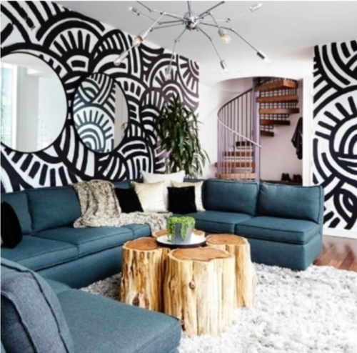
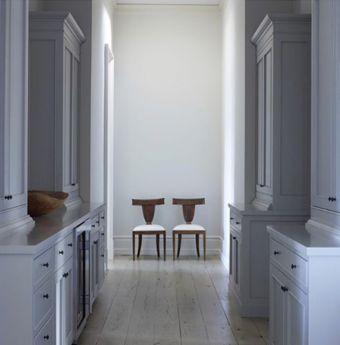
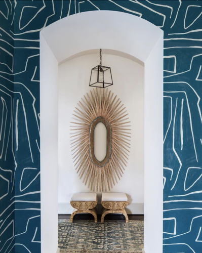
Out of Sight, Out of Mind?
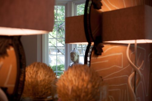
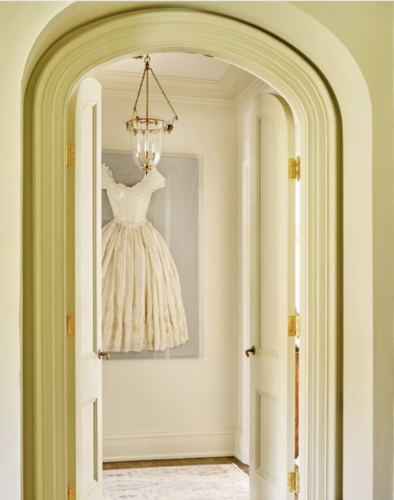
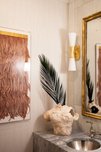
Let’s start with a few images of how I have used sight lines and focal points in my home…Buddha framed by a main window, a feathery welcome on the wall as you enter the powder room, bold pattern and organic accents on the dominant wall as you approach the sitting room, and pink doors to welcome you in the entrance hall. Now let’s explore how you can transform your own interiors by making the most of this design element.

I just love a well dressed sight line in a house, that place that pulls your eye through the space and lands on all kinds of wonderfulness! This is called making the most of a focal point, and people, this is good design. When done right, it is a literal feast for the eye.
We all like to make the most of our own looks, right? We know our “better side” for photographs and which physical attributes to highlight when dressing and making wardrobe selections. Well your home has its own special assets, its “better side”, its potential pieces de resistance. The question is are you making the most of them? You are your home’s stylist, and as such you need to capitalize on its best features, particularly its focal points, and seize the opportunities they offer to show off these spaces.
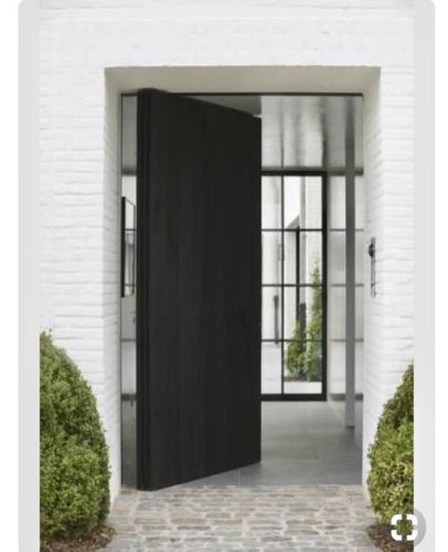
As you walk through your home, start to look at it a little differently. What are the sight lines as you move from room to room? You always want to draw the eye through a space and let it settle on something strong, interesting in shape or material, colorful, light reflective, or boldly patterned. The end of a long hallway is my absolute favorite place to work this styling magic. Or, it could be the optimally placed arched window or window dressing, a unique set of doors, or a dominant wall facing you as you approach the room. All the places your eye lands are design opportunities just waiting for your to give them a little love, and a little love goes a long way. For example, try a lacquered accent paint color on the wall at the end of a hallway with a single chair in an opposing texture, a single papered wall for a pattern punch, an earthy, organic chandelier over a simple table, a beautiful set of carved, bleached wood antique doors, a special hood over the range in your kitchen, or an oversized mirror or abstract painting to hold court over the chest that greets you when you enter your space. If you treat these visual avenues and their landing zones as the heroes in your interiors, you will raise the style factor of the whole space exponentially. So we say a big NO to the question posed in the above title! Absolutely not to “out of sight, out of mind”. Instead, let’s go for “I couldn’t pull my eye away and wow, I can’t stop thinking about the stroke of stylistic brilliance I just witnessed in that wonderful space!”
The shots below are examples of beautifully designed focal points, drawing you in by making the most of their sight lines.
Images clockwise from top left via @kerrykirkphoto, @orange_party, @emdesigninc, @homecurators, @atlantahomesmagazine, @lonnymag, @jeffreyneveinteriordesign, @odginteriors, @kerrykirkphoto, @emdesigninc, @marievrot, and @nicoledavisinteriors.
So carpe domus everyone! Share any pics you may have of the “well appointed focal point” in comments below. XO|ak
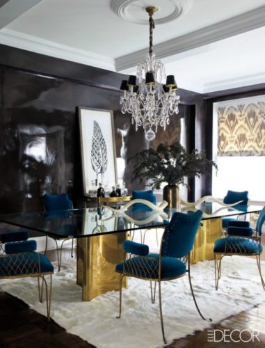
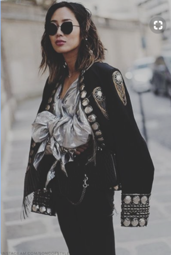
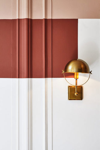
Mixed Metals Mojo
Oh yes you can. Yes, ma’am. Throw on that dangly, clangy silver coin charm bracelet with a stack of gold or brass skinny cuffs. Rock those gunmetal earrings with your aged brass chain and bead necklaces. Go ahead and add those warm brass or copper sconces in your powder room along with your polished nickel lavatory faucet. The question isn’t “can I do this?” but rather “how do I do this right?” And if you mix metals the right way when you open your jewelry box, put together your date night outfit, or ponder the design scheme for your new room, you will have expanded your creative range beyond the usual predictable pairings.
Let me share with you a few of my favorite mixing tips.
In home design…
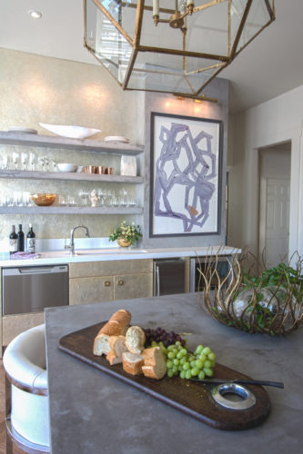
Polished nickel has a very warm undertone as opposed to chrome or even satin nickel. Those warm undertones allow you to mix in the golds and brasses. Your kitchen and bath fixtures and your cabinet hardware and lighting do not have to share the same metallic finish. The trick is to have one dominant finish for most of your metal selections and then pop in the second finish as a singular element. I often refer to this as “throwing it off”. Throwing it off is a good thing. It adds one outlier element, different but still compatible to the main aesthetic in the space, so that everything doesn’t look too samey or matchy. For example, if you are working on a new room, use all burnished brass curtain hardware, cabinet pulls and door hardware. Then add in a warm gold coffee table and mix in a few touches of brass and gold in your accessories. Make the room really pop by layering in a knock out chandelier in aged or black iron, polished nickel or pewter. It will be a lone ranger in the space, but in a good way.
Below are several shots of my home and a client’s kitchen where there is a whole lot of metal mixing going on! In the living room photo, the mix reads very subtle because you are looking at predominantly warm gold and brass tones…the antiqued gold coffee table, the brass chair base, aged gold tall candlesticks mixed with a dark iron mirror and a chandelier with a mix of copper and silver metallic mesh. In the kitchen shot, the cabinets are done in a subtle gold finish, the chandelier is brass, the metal bowl gold, but these warm metallics mix seamlessly with a polished nickel bar faucet and stainless steel appliances. You get the idea.
In fashion….
Unless you are wearing runway everyday and can get away with things like sporting a gold squirrel on your head, use the metallics as pops and punches. We aren’t channeling Cher in Bob Mackie here, let’s keep it special with small hints of metallic mayhem. The silver clutch, the gold strappy sandal, the sequined top are all you need and YES, YES, YES …mix away! The metallic master knows it is okay to carry the silver clutch with her mostly gold jewelry and the pewter stiletto with those awesome chunky brass bangles. She is sneaky smart, and she is you.
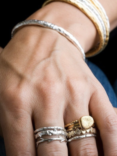
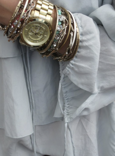
Finally, in both home design and fashion, remember it is the tone of the metal more than the metal finish itself.
- Aged or burnished brass (my fave) looks better with matte silver and pewter than shiny silver
- Satin brass is more forgiving than shiny brass when mixing your metals
- The warmth of polished nickel is your go to tone when mixing silver with gold or brass
- Gunmetal or dark iron is your more earthy and neutral metal which will calm things down if things are getting too shiny
- When it is an option, choose a champagne metal finish because it is already mixed up for you…love a champagne finish
So have fun and enjoy mixing it up. It’s way more fun than those tired old rules. Trust me, those blurred lines of what you think you can and can’t do is where you want you want to be!
Images courtesy of Mack Home — Studio McGee — 1chicfashiondesign — firstview.com — stylecaster.com — Pinterest.com
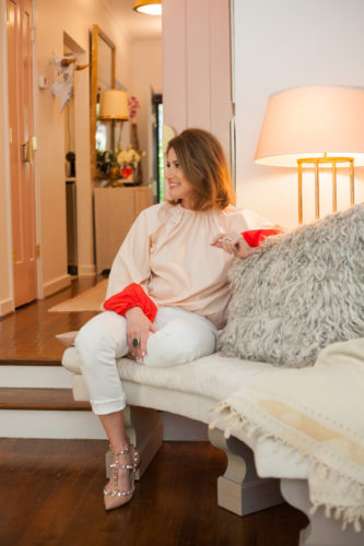
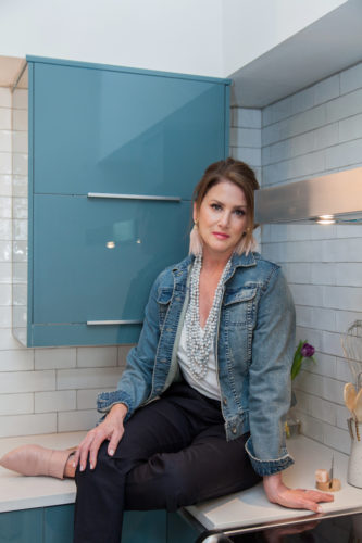
Photos of Anna’s home by Brennan Brooker.
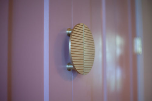
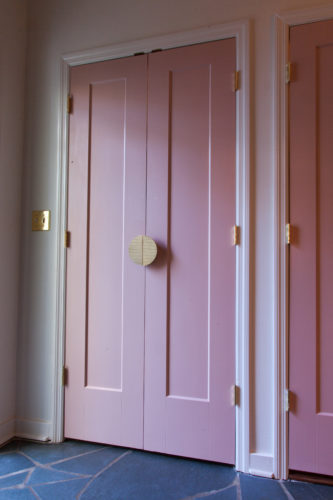
The Skinny on Millennial Pink
I get the hype, I do. It’s the “it girl” of color; everyone seems to be using it in interior design, home decor, and fashion. Recently my own spin on it is the “pièce de résistance” of my just completed home renovation…. a hallway filled with pink doors. But not because this color is trendy…
It may surprise you to learn that pink is actually an ancient color. It has been used on doors, walls, and other architectural accents for centuries. Pink sand stretches out in graceful carpets on many of our worlds’ beaches. It might be “on trend” now, but the beauty and universality of this color is derived from it’s colorful (pun intended) history.


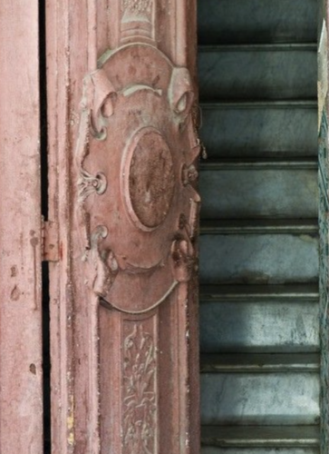
Pink appears in our natural world everywhere, showing off it’s rich beauty. Already organically woven into our lives, it is no wonder we’re so drawn to it. Explore your inner pink prowess and take a chance on this new neutral by adding a pop of pink to your home. Each time I enter my house, for some reason my new doors still surprise me a little, and I continue to delight in the way the funky brass hardware pops off this particular shade of dusty pink. As I then look down my happy hallway, my eye is drawn into the step-down living room where pale, orchid heavyweight cotton curtains frame two sets of French doors leading to the courtyard. Ahhh…..Sometimes it’s the little things that, if we slow down enough to take them in, are all we need to elicit a smile, and to be happy in the moment.
Fun Facts/How To’s:
How do you get the right pink? Trust me, I do this for a living, and it’s not easy. Handy little paint trick….if you ever try out a color that is either too dark or muddy, sort of “too much” of what it looks like on the paint strip, have your paint store add a drop of black. That is how I got my millenial pink mojo going just perfectly for my space.
If you are not feeling millennial and dusty pinkish, all shades of this iconic color – blush, hot pink, ballet, rose, and even salmony pink – all look good with varying shades of brass and gold hardware.
I’d love to see your take on this new neutral. Go ahead….the pink world is your oyster! Tag @anna.kemper.atelier in your post!
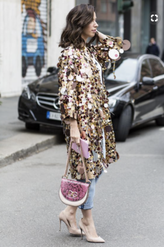
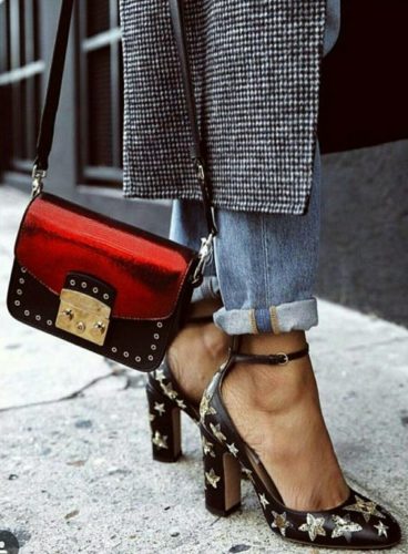
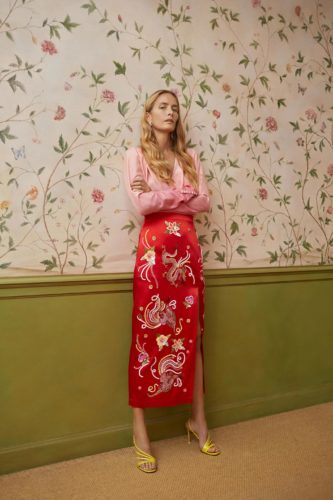
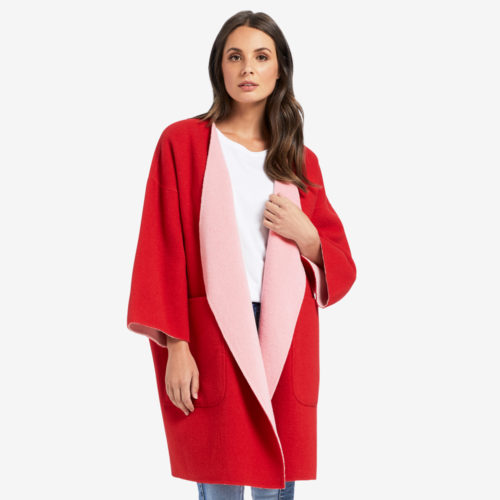
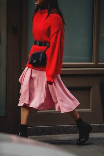
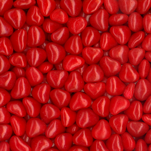
Pink and Red
Pink and red.. a combination not just for Valentines anymore. Let’s think bigger than chocolates and conversation hearts and acknowledge that pink and red is all grown up now. We have changed and evolved, so this color combo had to as well. This is a good thing!
Sadly, this duo is often overlooked as a sophisticated and fresh color combination somewhat in fashion and definitely as a color palette in interior design. And while they are clearly in the same color family, people tend to shy away from using them together. If you are seeking a fresh pairing for your spring and summer closet or shooting for a not so typical choice for a room refresh or redo, why not give these color cousins a shot at helping you out?
Pink and Red Meets Design
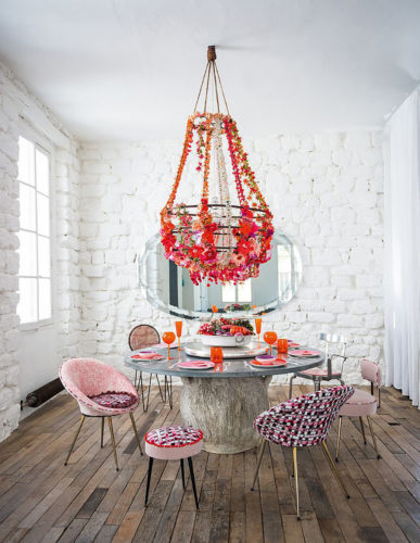
These design photographs just blow me away showing off their pinky-redness. The takeaway here is that the primary accent color combo of pink and red tones showcases so beautifully because it is paired with a neutral palate. Chalky white tones for the walls and decorative elements bring a great mix of neutral color and texture. Personally, this is my favorite way to use this hidden gem for a chic color collaboration.
It’s important to remember, you have a whole slew of tonal options. Think rust and scarlet for red as well as the brights and jewel tones; use the full palette of pinks and go dusty or earthy in addition to the pastel and orchid hues as seen in these stylish and chic spaces.
So go ahead and try your hand at mixing and matching with this inspired and dynamic design duo and see what you can come up with. And if you are feeling nostalgic, you can even snack on conversation hearts and red hots while designing your new space!
Pink and Red Meets Fashion
Combining elements of pink and red in fashion is just a matter of permission and experimentation. The pink and red police are not coming after you, so there is your permission. Remember those little reminders I mentioned about using the full tonal range of the pink and red color spectrum in your design endeavors? Well, don’t forget to apply them when creating your new wardrobe additions. Start experimenting! And if you need a little inspiration to get you going, here is my favorite pink and red look from my closet. This great shirt came from Canary (@shopcanary), one of my favorite stores out of Dallas.

Or check out these great street style looks making the most of the pink-red possibilities:
Oh, and if you are starting to feel a little sick from eating all that sugary Valentine’s Day candy, lets pretend to be grown ups and sip on a pale pink French rosé. We all need a little liquid inspiration from time to time.. I find it greatly enhances creativity.

Images courtesy of SF Girl – Domino – Decor 8 – The Girl from Panama – Jonathan Daniel Pryce – Seed Heritage – Shein – The Every Girl – Pinterest
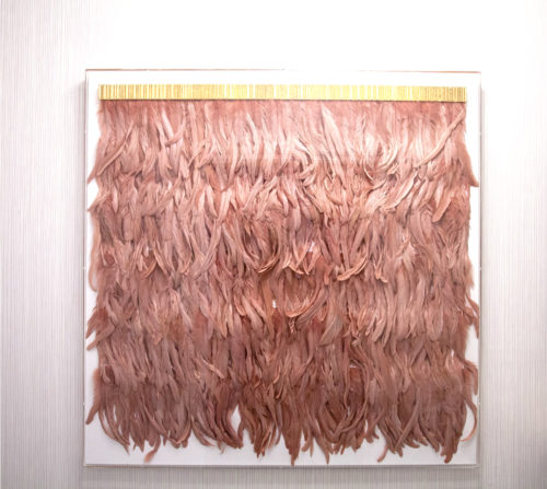
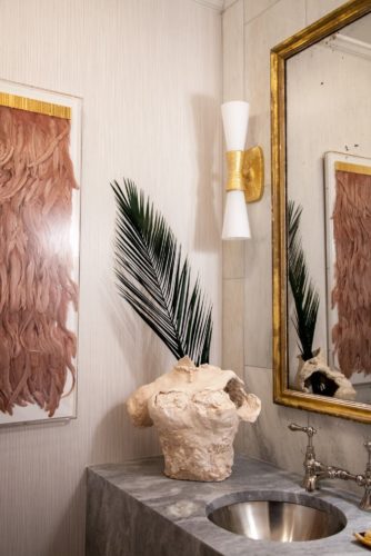
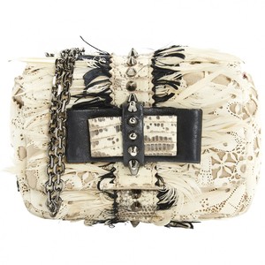
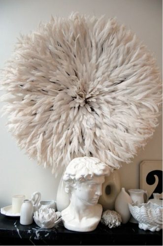
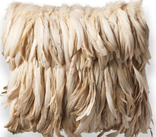
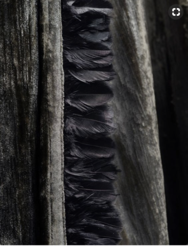
Let’s Get Real about Feathers
I am forever inspired by feathers. They are just so …. feathery. Their colors are boundless, their textures wonderfully varied, and their inherent design dizzyingly delectable. Why are so feathers so perfect? Look no further than Mother Nature, I always say she is the best designer of all.
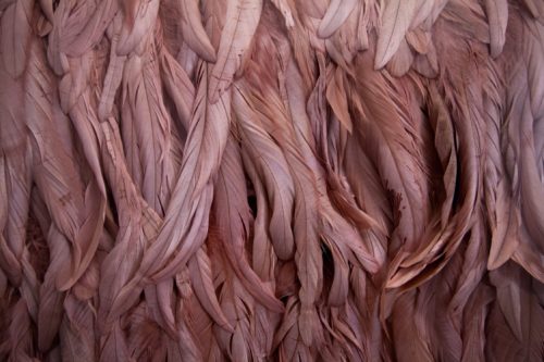
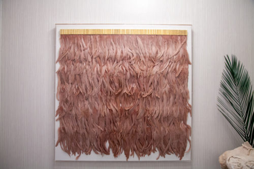
To me, feathers exemplify the essence of my aesthetic message. Why? Because they represent the often blurred lines between all facets of design, particularly home and fashion. Their look is timeless and knows no age boundaries, and being an organic element, they can be “that thing” that separates the men from the boys in upping your style quotient. Here you see one of my favorite pieces of art… rose colored feathers topped with a gold valance, framed in acrylic. Feathers, gold and acrylic….can you think of a better combo to enhance your home decor? And check out my two favorite pair of feather earrings. They sit front and center in my jewelry box as a quick fashion fix for added style. When wearing feather earrings, let them be the hero. Keep necklaces minimal such as simple beads or a dainty gold pendant.
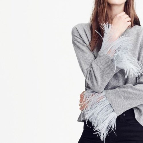
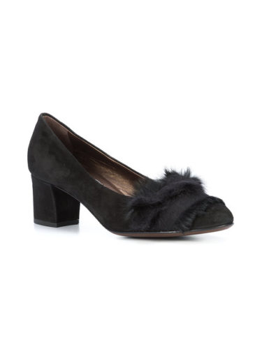
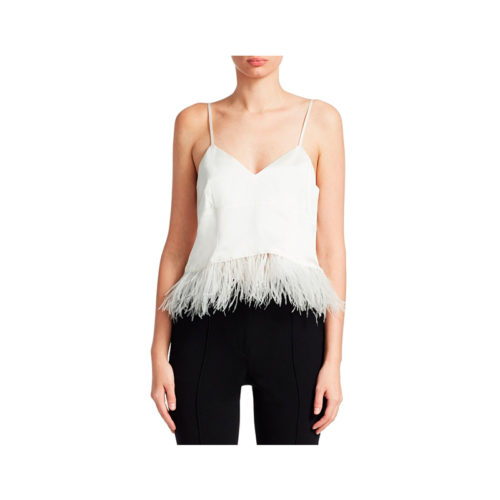
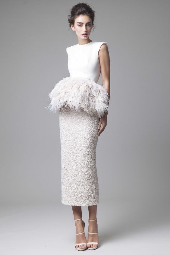
In decorating, the airiness of the ostrich feather added to a pillow or as trim for a throw is perfection. Or the lush density of color all packed into one little peacock feather just totally nails it. So pluck that peacock and arrange your little treasures on a canvas or dechaled edge paper and stand back to admire your new piece of art. Trim your white linen curtains with guinea fowl feathers and you have elevated your black and white palette with texture and organic luxury. Dangly feather earrings will never fail to bring you compliments, especially with your favorite up do. Add a pop of feathers to the hem of your silky cami or ostrich around the cuff of your fitted turtleneck sweater, and you have just turned a basic staple into something so much more chic. If you’re more of a tailored gal, just clip a feather accent to the toe of your favorite black pumps or add a feather lapel pin to your go-to blazer and you have finessed some major flair with one simple touch. No fashion faux pas here ladies… the feather world is beckoning you. See these style shots below for a little feather inspo. Fear not and take flight!

Images courtesy of JCrew – Erineverafter – Shopbop – Vestiaire Collective – Krikor Jabotian – Pinterest – Saks Fifth Avenue – MACK Home – Andrew.martin.uk